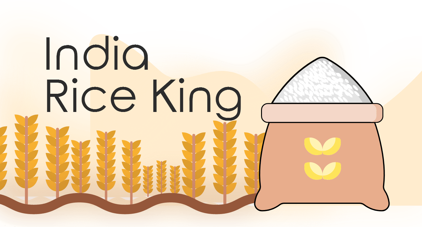

The client was well established rice mill owner from Raipur who has his own brandof rice named India Rice King. India Rice King is a well established rice brand in Raipur and offers high quality rice to its customers.
India Rice King aims to bring quality rice to its customers at an effective price. It intends to compete with some of the best rice manufacturers in India.
The task was to create a logo that is minimal and modern that would go well with the packaging that was also to be designed by our designers.
The task was to create a logo that is minimal and modern that would go well with the packaging that was also to be designed by our designers.

Before we approach any design, our first step is to understand our client. We would want to clearly determine their expectations and requirements. By doing so, we are able to establish an appropriate premise that would help us crack the design.
This was one of the longest projects our designers have worked on and most of this time was spent on thoroughly understanding the client and his demands.


Many meeting sessions were organized and our designers would try to understandthe actual requirements of the client. There several references that our designers worked on and some designers even crafted some rough illustrations to bring forth the opinion of the client which would eventually help determine the directionthat this project needs to take.
This was a comparatively long project which is why, designers discovered a new aspect of the client with every passing day and worked tirelessly towards bringingevery detail to life.
Time to start working on the main aspects.
Designers focused on the client’s vision for the logo which was to incorporate the crown as the main element of the logo.
He designers worked on renditions that would suit his vision the best.
Designers tried to use a much modern typography within the logo help create a logo that is much modern looking like the client specified.
The logo was created with the packaging design in mind and was tweaked to fit the vision that designers had for the packaging design for the brand.
This is the final logo for India King Rice. As you can see, the designers tried to meet all the aspects that the client specified. The logo is both modern and royal and manages to balance these contrasting ideologies in a striking way.
The main branding element that was required by the client was the packaging, in other words the rice bag’s design. There are several rice brands in India since riceis an integral part of every Indian’s life. Therefore, it was important to create a unique and appealing package design that stands out among the rest.
The designers used illustrations on the packaging to create a lively and natural look and accompanied this look with vibrant pop color palette that is sure to catchones eyes.
That is the end of our case study of India Rice King’s logo design and branding. The key element to understand from this case study is patience.
A good design requires consistent effort and patience. Our designers remained dedicated throughout the process to deliver 100% satisfaction to our client and in the end, isn’t that the very thing that counts?